CSS Organizational Charts A Complete Guide to Hierarchy Chart Design
1 month ago · Updated 1 month ago

In the world of web development, data visualization is a critical skill. Among the many types of charts and diagrams developers use to communicate information, the organizational chart sometimes called an org chart, organigram, or organogram — stands out as one of the most universally recognizable. Whether you are designing a corporate website, building an internal HR tool, or mapping out a complex system architecture, knowing how to craft a clean, responsive organizational chart using only HTML and CSS is an invaluable ability.
This comprehensive guide walks you through everything you need to know about CSS organizational charts. You will learn what they are, when to use them, and most importantly, how to build one from scratch using modern CSS techniques including CSS Grid, pseudo-elements, and responsive media queries all without writing a single line of JavaScript.
The chart we will build together has four levels of hierarchy and describes the structure of a fictional company. Along the way, we will dive deep into the CSS mechanics that make it work, explore design decisions, and discuss best practices for making your chart responsive on smaller screens. By the end, you will have a solid, reusable foundation you can adapt for any hierarchy visualization project.
This tutorial assumes a working knowledge of HTML and CSS. Familiarity with CSS Grid and pseudo-elements will be helpful, though all relevant concepts are explained as we go.
What Is an Organizational Chart?
Before we begin writing code, it is worth understanding exactly what an organizational chart is and where it is commonly used. According to Wikipedia, an organizational chart is "a diagram that shows the structure of an organization and the relationships and relative ranks of its parts and positions or jobs." The term is also applied to similar diagrams, such as those showing the different elements of a field of knowledge or a family tree.
At its core, an organizational chart visualizes hierarchy. It shows who reports to whom, which departments belong under which divisions, and how the various parts of a structure relate to each other. The visual format makes it much easier for viewers to grasp complex relationships at a glance compared to reading the same information in text form.
Common Use Cases
Organizational charts appear in a wide variety of contexts on the web and in print:
- Corporate Websites: The "About Us" or "Company" page of a business website often features an org chart showing the executive team and reporting structure.
- Family Trees: Genealogy websites and family history tools frequently use org-chart style layouts to show generational relationships.
- Government Structures: Public sector websites use org charts to show the hierarchy of agencies, departments, and officials.
- Project Management: Teams use org charts to visualize project hierarchies, deliverables, and responsibilities.
- Technical Documentation: Software architecture diagrams often use a hierarchical layout similar to an org chart to show system components and their relationships.
- Educational Content: Teachers and instructional designers use org-chart style diagrams to show concept hierarchies in subjects like biology (taxonomy), linguistics (language families), or philosophy (schools of thought).
In every case, the key advantage of an organizational chart is clarity. Humans are exceptionally good at reading hierarchical visual structures. A well-designed chart allows a viewer to understand reporting relationships and levels of authority in seconds.
Anatomy of an Org Chart
Every organizational chart, regardless of its specific content or context, shares a common structure:
- Nodes: Each individual box or element in the chart represents a node. A node might represent a person, a role, a department, or any other entity in the hierarchy.
- Levels: Nodes are organized into horizontal tiers called levels. The topmost level (Level 1) holds the highest-ranking entity. Lower levels represent subordinate relationships.
- Connectors: Lines or paths drawn between nodes indicate relationships. A line from a parent node down to a child node means the child reports to or belongs under the parent.
- Root Node: The single node at the very top of the chart, from which all other nodes descend, is called the root.
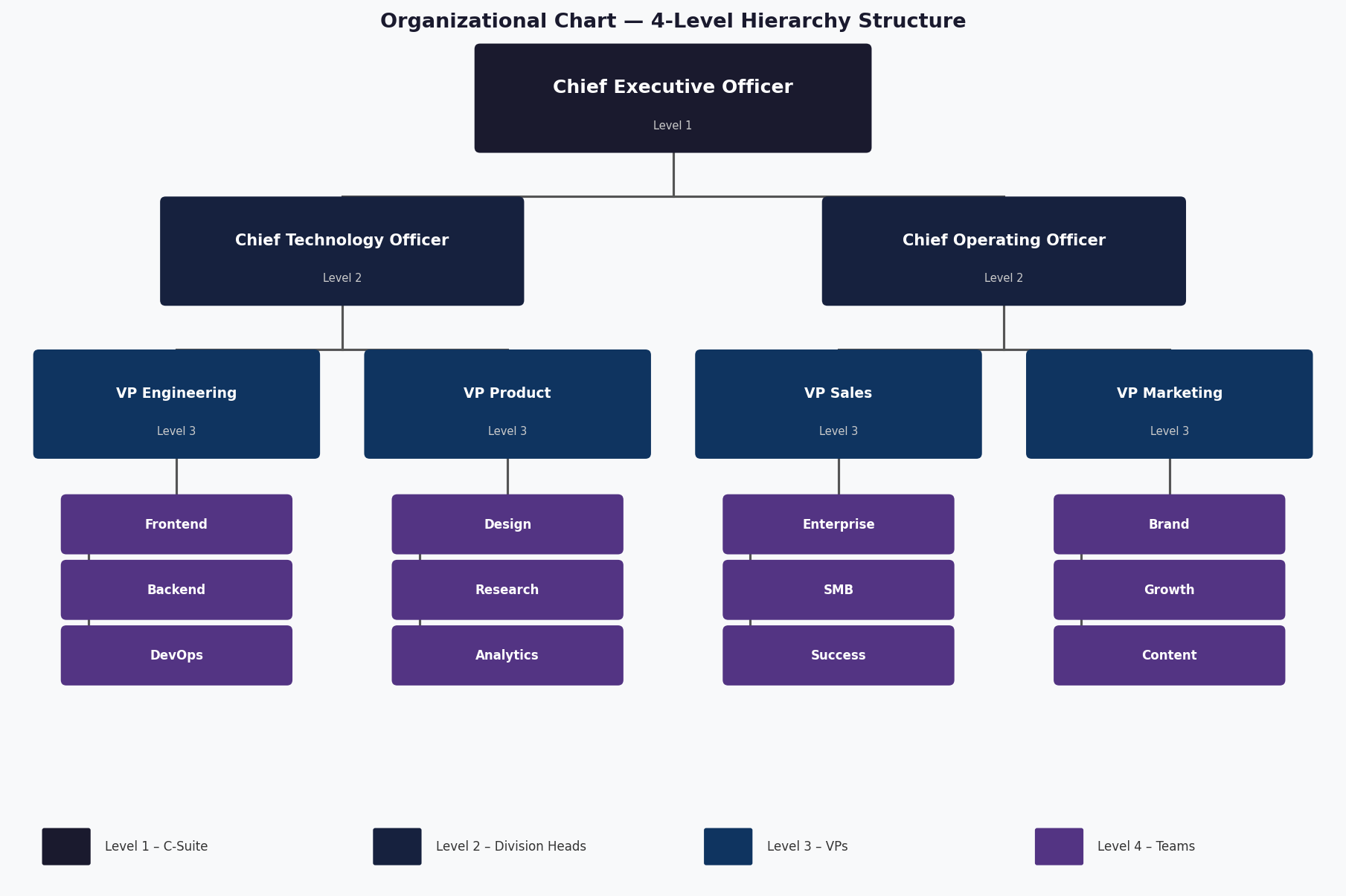
Figure 1: The four-level organizational hierarchy we will build, showing CEO, C-suite, VP, and team levels
Understanding this anatomy is important because it directly maps to how we will structure our HTML and CSS. Each level will correspond to a set of HTML elements, and the connectors will be drawn using CSS pseudo-elements.
Planning the Chart
Good CSS development starts with good planning. Before you write a single line of code, take the time to sketch out your chart and think through its structure. This upfront thinking will save you significant time and frustration during implementation.
Defining the Hierarchy
For our example chart, we will model a company with the following four-level hierarchy:
- Level 1 (Root): The Chief Executive Officer (CEO) — a single node at the top of the organization.
- Level 2: Two executive vice presidents who report directly to the CEO: the Chief Technology Officer (CTO) and the Chief Operating Officer (COO).
- Level 3: Four Vice Presidents (VPs), two under each Level 2 node: VP Engineering and VP Product under the CTO; VP Sales and VP Marketing under the COO.
- Level 4 (Leaf): Sixteen individual teams, four under each VP — representing the frontline operational units of the company.
This creates a balanced binary tree structure that is ideal for demonstrating the core techniques. In a real-world scenario, your chart may be unbalanced — with different numbers of children at each node — but the same principles apply.
Choosing a CSS-Only Approach
It is worth pausing to ask: why CSS only? Why not use JavaScript or a library like D3.js, Highcharts, or GoJS?
There are several excellent reasons to favor a CSS-only approach for organizational charts:
- Performance: CSS charts require no JavaScript parsing, execution, or DOM manipulation. This makes them extremely fast to render, especially on low-powered devices.
- Accessibility: When built with semantic HTML (using heading elements and ordered lists), CSS charts are inherently more accessible than canvas or SVG-based alternatives.
- Simplicity: For charts with a fixed structure that does not change dynamically at runtime, a CSS-only approach involves far less code and complexity than a JavaScript solution.
- No Dependencies: You do not need to install, maintain, or load any external libraries. Your chart works anywhere CSS is supported.
- SEO Benefits: Because the structure is defined in semantic HTML, search engines can read and understand the content of your chart.
Of course, CSS-only charts have limitations too. They are best suited for static structures. If you need to dynamically generate the chart from data at runtime, render large numbers of nodes, or add complex interactive behaviors like zoom and pan, a JavaScript library becomes necessary. For our purposes, however, CSS is the perfect tool.
Setting Up the HTML Structure
The HTML structure of an organizational chart is a nested list. This is semantically appropriate because a hierarchy is, at its core, a list of lists. We use ordered lists (<ol>) rather than unordered lists (<ul>) because the order of nodes matters — it reflects the left-to-right visual position of the nodes on screen.
The Container
Everything lives inside a container div that centers and constrains the width of our chart:
| <div class="container">
<!-- Chart goes here --> </div> |
The container uses a max-width to prevent the chart from stretching too wide on large screens, and auto horizontal margins to center it. This is a fundamental layout pattern in CSS that ensures our chart looks good on screens of all sizes.
Level 1 — The Root Node
The first level contains a single node: the CEO. We use an h1 element for this because it is the most semantically important element in our chart — just as the CEO is the most important position in the company hierarchy:
| <h1 class="level-1 rectangle">Chief Executive Officer</h1> |
Using semantic heading elements (h1 through h4) for our chart nodes is a deliberate accessibility choice. Screen readers will announce these headings, giving users who cannot see the visual chart an understanding of the hierarchy through the heading structure.
Level 2 — First Branch
The second level uses an ordered list with two list items. Each list item contains an h2 element:
| <ol class="level-2-wrapper">
<li> <h2 class="level-2 rectangle">Chief Technology Officer</h2> </li> <li> <h2 class="level-2 rectangle">Chief Operating Officer</h2> </li> </ol> |
Nesting Deeper Levels
Levels 3 and 4 follow the same pattern of nesting lists inside list items. The key principle is that each level-3 list lives inside one of the level-2 list items, and each level-4 list lives inside one of the level-3 list items. This nesting creates the hierarchical HTML structure that our CSS will then style into a visual chart.
The complete nesting looks like this at a conceptual level:
| level-2-wrapper (ol)
li (under CTO) h2 (.level-2) "CTO" level-3-wrapper (ol) li h3 (.level-3) "VP Engineering" level-4-wrapper (ol) li > h4 (.level-4) "Frontend" li > h4 (.level-4) "Backend" ... li h3 (.level-3) "VP Product" ... li (under COO) h2 (.level-2) "COO" ...(same structure) |
This nested list structure is both semantically meaningful and provides the DOM parent-child relationships that CSS needs to draw the connecting lines correctly.
Core CSS Techniques
Now that we understand the HTML structure, let us look at the CSS techniques that transform it into a visual hierarchy chart. Three techniques are foundational: CSS custom properties for theming, CSS Grid for layout, and pseudo-elements for connectors.
CSS Custom Properties
We use CSS custom properties (CSS variables) to define our color scheme at the top of our stylesheet. This makes it easy to retheme the chart or adjust colors in one place:
| :root {
--level-1: #8dccad; /* Green for CEO */ --level-2: #f5cc7f; /* Yellow for C-Suite */ --level-3: #7b9fe0; /* Blue for VPs */ --level-4: #f27c8d; /* Pink for Teams */ --black: black; /* Connector color */ } |
Custom properties cascade like any other CSS property, which means you can override them in specific contexts (for example, in a dark mode media query) without touching the rest of your stylesheet. This is a best practice for any CSS project of meaningful complexity.
The Rectangle Base Class
Every node in our chart shares a common set of styles defined in the .rectangle class:
| .rectangle {
position: relative; padding: 20px; box-shadow: 0 5px 15px rgba(0, 0, 0, 0.15); } |
The position: relative declaration is critically important. It creates a positioning context for the absolutely positioned pseudo-elements that will serve as our connector lines. Without this, the pseudo-elements would be positioned relative to the nearest positioned ancestor, which would likely produce incorrect results.
CSS Grid for Horizontal Layout
The most powerful tool in our layout arsenal is CSS Grid. We use it to arrange the nodes of levels 2 and 3 horizontally, side by side. The grid is set up with equal-width columns using the repeat() function and the fr unit:
| .level-2-wrapper {
position: relative; display: grid; grid-template-columns: repeat(2, 1fr); }
.level-3-wrapper { position: relative; display: grid; grid-template-columns: repeat(2, 1fr); grid-column-gap: 20px; width: 90%; margin: 0 auto; } |
The fr unit represents a fraction of the available space in the grid container. So repeat(2, 1fr) creates two equal-width columns, each taking up exactly half the available width. This elegant approach automatically adapts to any container width.
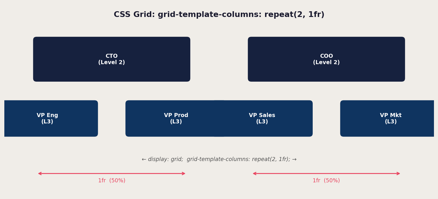
Figure 2: How CSS Grid divides space equally with repeat(2, 1fr)
Position: relative on the wrapper is again essential — it makes the wrapper a positioning context for the pseudo-elements we will add to draw the horizontal connector bar between nodes.
Pseudo-Elements as Connectors
This is where the real magic happens. CSS pseudo-elements — specifically ::before and ::after — allow us to generate visual content that is not in the HTML markup. We use them to draw the vertical and horizontal lines that connect parent nodes to their children.
Every pseudo-element that creates a connector shares these base properties:
| content: ""; /* Required: empty string makes the element visible */
position: absolute; /* Positions relative to nearest positioned ancestor */ background: black; /* The line color */ |
A vertical connector going down from a parent node to the horizontal bar above its children uses the top: 100% trick, which positions the pseudo-element immediately below the bottom edge of its parent:
| .level-1::before {
content: ""; position: absolute; top: 100%; /* Start at bottom of parent */ left: 50%; /* Horizontally centered */ transform: translateX(-50%); width: 2px; /* Thin vertical line */ height: 20px; /* Gap between levels */ background: var(--black); } |
A horizontal connector spanning across the tops of multiple child nodes uses a percentage-based left offset and width to span the right distance:
| .level-2-wrapper::before {
content: ""; position: absolute; top: -20px; /* Just above the children */ left: 25%; /* Start at center of first column */ width: 50%; /* Span to center of last column */ height: 2px; /* Thin horizontal line */ background: var(--black); } |
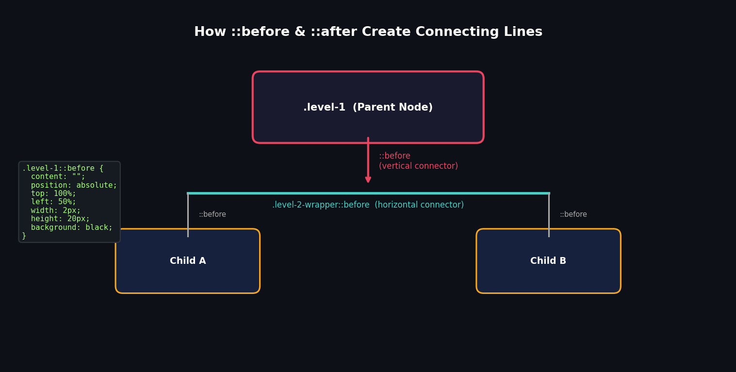
Figure 3: How ::before pseudo-elements create the vertical and horizontal connecting lines
The combination of a vertical line from each parent down to a horizontal bar, with further vertical lines dropping from the horizontal bar to each child, creates the classic tree-connector visual that makes organizational charts immediately recognizable.
Building Each Level in Detail
Level 1: The CEO Node
The first level is the simplest: a single centered element with a downward connector to Level 2. Its width is set to 50% of the container and centered with auto margins:
| .level-1 {
width: 50%; margin: 0 auto 40px; background: var(--level-1); } .level-1::before { content: ""; position: absolute; top: 100%; left: 50%; transform: translateX(-50%); width: 2px; height: 20px; background: var(--black); } |
The margin-bottom of 40px creates the vertical space between Level 1 and the horizontal connector that bridges to Level 2. The 20px pseudo-element height occupies the first half of this gap; the rest is occupied by the connector from Level 2 up.
Level 2: The Branch Nodes
Level 2 introduces the grid layout and multiple pseudo-elements working in concert. The wrapper ol uses CSS Grid to place its two list items side by side. The wrapper then uses its ::before pseudo-element to draw a horizontal bar connecting the two columns.
Each individual list item also gets a ::before pseudo-element that draws a short vertical line from the horizontal bar up to each Level 2 box:
| .level-2-wrapper > li::before {
content: ""; position: absolute; bottom: 100%; left: 50%; transform: translateX(-50%); width: 2px; height: 20px; background: var(--black); } |
Note the use of bottom: 100% here rather than top: 100%. This positions the line going upward from the list item, rather than downward from the h2. Both approaches can work; the choice depends on which element serves as the positioning reference.
Each Level 2 box also has its own ::before for a downward connector to Level 3, and a ::after that is initially hidden (display: none) but becomes visible on small screens for the responsive mobile layout.
Level 3: The Sub-Branch Nodes
Level 3 follows the same pattern as Level 2, but with a narrower wrapper (width: 90%) to keep the nodes visually nested under their Level 2 parent. The horizontal connector for this level uses calc() to compute precise pixel offsets:
| .level-3-wrapper::before {
content: ""; position: absolute; top: -20px; left: calc(25% - 5px); width: calc(50% + 10px); height: 2px; background: var(--black); } |
The calc() adjustments here compensate for the column gap between the two Level 3 nodes. Without them, the horizontal bar would not quite reach the center of each column, creating a visual misalignment.
Level 4: The Leaf Nodes
Level 4 takes a different visual approach. Rather than arranging nodes horizontally like the higher levels, Level 4 nodes stack vertically in a column to the right of their Level 3 parent. This design choice is driven by space constraints — at this depth, horizontal layout would require too much horizontal space and would break on most screen sizes.
The vertical stacking is achieved by not using CSS Grid at all for this level. Instead, the wrapper has a right-aligned margin that indents it under its parent, and a single vertical line on the left side connects all the leaf nodes:
| .level-4-wrapper {
position: relative; width: 80%; margin-left: auto; /* Push to the right */ } .level-4-wrapper::before { content: ""; position: absolute; top: -20px; left: -20px; width: 2px; height: calc(100% + 20px); /* Full height of all nodes */ background: var(--black); } |
Each individual leaf node then has a short horizontal connector coming from that vertical rail on the left:
| .level-4::before {
content: ""; position: absolute; top: 50%; left: 0%; transform: translate(-100%, -50%); width: 20px; height: 2px; background: var(--black); } |
The transform: translate(-100%, -50%) moves the pseudo-element to the left of the node (the -100% on the X axis pushes it out of the node's box) and centers it vertically (-50% on the Y axis aligns it with the middle of the node).
Making the Chart Responsive
One of the most challenging aspects of CSS organizational charts is making them work well on small screens. A chart that looks perfect on a desktop monitor can become completely unreadable on a phone. The solution requires a thoughtful redesign of the layout for small viewports, not just scaling it down.
The Mobile Layout Strategy
On small screens (below 700px), we switch from a horizontal multi-column layout to a vertical left-to-right tree layout. Instead of placing nodes side by side in a grid, we stack them vertically and use a vertical rail on the left side of the screen, with horizontal branches extending to the right for each node.
This is a fundamentally different visual structure from the desktop layout, which is why making it responsive requires more than a simple media query adjustment — it requires rethinking the connector geometry entirely.

Figure 4: Desktop vs. mobile layout — the chart restructures completely for small screens
Mobile Media Query
The responsive behavior is achieved through a single media query targeting screens narrower than 700px:
| @media screen and (max-width: 700px) {
.rectangle { padding: 20px 10px; } .level-1, .level-2 { width: 100%; } .level-1 { margin-bottom: 20px; } /* Hide desktop vertical connectors from level-1 */ .level-1::before, .level-2-wrapper > li::before { display: none; } /* Switch level-2-wrapper from grid to block */ .level-2-wrapper, .level-2-wrapper::after, .level-2::after { display: block; } .level-2-wrapper { width: 90%; margin-left: 10%; } /* Repurpose ::before as a vertical rail */ .level-2-wrapper::before { left: -20px; width: 2px; height: calc(100% + 40px); } .level-2-wrapper > li:not(:first-child) { margin-top: 50px; } } |
Several key changes happen here. The level-2-wrapper switches from display: grid to display: block, stacking the level-2 items vertically. The ::before pseudo-element of the wrapper — which was a horizontal bar on desktop — is repurposed as a vertical rail by changing its width and height. Individual level-2 items get spacing between them with margin-top.
The ::after pseudo-element on the level-2 boxes — which was hidden on desktop — becomes visible on mobile. It draws a short horizontal branch extending from the vertical rail to each level-2 node, completing the tree connector visual.
Mobile-First vs. Desktop-First
The author of the original tutorial notes that making this chart responsive was so complex that the markup had to be reconstructed multiple times. With this in mind, a mobile-first approach — where you write your base styles for mobile and use min-width media queries to progressively enhance for larger screens — is strongly recommended for new projects.
With a mobile-first approach, you start with the vertical tree layout as your default and add the horizontal grid layout for wider screens. This tends to result in cleaner code because you are adding complexity for larger screens rather than overriding it for smaller ones.
Styling and Theming Your Chart
The structural CSS we have covered so far gives us a functional chart, but a polished, professional result requires attention to visual design as well. This section explores how to make your org chart look as good as it works.
Color Strategy
Using distinct colors for each level of your chart serves an important functional purpose: it allows viewers to instantly understand which level a node belongs to, even before reading the content. The original tutorial uses four pastel colors — green, yellow, blue, and pink — for levels 1 through 4 respectively.
When choosing your color palette, consider:
- Accessibility: Ensure sufficient contrast between text and background colors. Use a tool like the WebAIM Contrast Checker to verify WCAG compliance.
- Brand Alignment: On a corporate website, your org chart colors should complement or match the brand's color palette.
- Visual Hierarchy: Colors should reinforce the hierarchy, not fight against it. Level 1 might use your primary brand color, with subsequent levels using progressively lighter or more muted shades.
- Consistency: If your website uses a dark mode, make sure your chart's colors work in both light and dark contexts using CSS custom properties.
Typography
The text inside each node should be clear, readable, and appropriately sized. Some guidelines:
- Font Size: Level 1 nodes can be slightly larger than deeper levels to reinforce hierarchy. A common approach is to reduce font size by 1-2px with each level.
- Font Weight: Using bold text for higher levels and normal weight for lower levels further reinforces the visual hierarchy.
- Font Family: Stick to system fonts or a well-loaded web font for performance. Avoid loading multiple font families just for a chart.
- Text Overflow: Add white-space and overflow management so that long names do not break the chart layout.
Shadows and Depth
Box shadows add a sense of depth and elevation to your nodes, making the chart feel more modern and polished. The original tutorial uses:
| .rectangle {
box-shadow: 0 5px 15px rgba(0, 0, 0, 0.15); } |
This creates a subtle shadow that makes the nodes appear to float slightly above the page. You can vary the shadow intensity by level — more pronounced shadows for higher-level nodes, lighter shadows for lower ones — to further reinforce the hierarchy visually.
Hover States and Interactivity
Even without JavaScript, CSS allows you to add subtle interactive feedback to your chart. A hover effect on nodes can make the chart feel more alive and interactive:
| .rectangle {
transition: transform 0.2s ease, box-shadow 0.2s ease; } .rectangle:hover { transform: translateY(-3px); box-shadow: 0 12px 30px rgba(0, 0, 0, 0.25); } |
This gentle lift effect on hover provides visual feedback that the nodes are interactive elements, which is particularly useful if your chart nodes link to profile pages or department pages.
Accessibility Considerations
Building an accessible organizational chart requires thinking beyond the visual presentation. Users who rely on screen readers, keyboard navigation, or other assistive technologies need to be able to understand and navigate your chart effectively.
Semantic HTML
The approach we have taken — using heading elements (h1-h4) and ordered lists — is already a strong foundation for accessibility. Screen readers will announce the heading levels, giving users an implicit understanding of the hierarchy. The ordered list structure provides context that nodes are part of a structured list.
ARIA Attributes
For additional clarity, consider adding ARIA attributes to your chart. The role="tree" and role="treeitem" ARIA roles are specifically designed for hierarchical structures like org charts:
| <div role="tree" aria-label="Company organizational chart">
<div role="treeitem" aria-expanded="true" aria-level="1"> Chief Executive Officer </div> ... </div> |
Adding aria-label attributes to the chart container provides screen reader users with immediate context about what they are about to encounter.
Focus Management
If your chart nodes are interactive (for example, they link to individual profile pages), ensure that keyboard users can navigate between them using the Tab key. CSS :focus-visible styles should be included to provide visible focus indicators:
| .rectangle:focus-visible {
outline: 3px solid #0f3460; outline-offset: 2px; } |
Alternative Text for Visual Connectors
The CSS pseudo-elements that draw connector lines are purely visual — they are not read by screen readers. This is actually appropriate, since the hierarchical relationships are already communicated through the HTML structure. There is no need to add text descriptions of the connector lines themselves.
Performance Optimization
One of the primary advantages of a CSS-only organizational chart is its excellent performance profile. However, there are still steps you can take to ensure your chart renders as efficiently as possible.
Minimizing Repaints
Hover effects and transitions that change layout properties like width, height, or margin can trigger expensive browser repaints and reflows. Where possible, prefer transform and opacity for animations, as these can be composited on the GPU and avoid layout recalculation:
| /* Prefer this (GPU-composited): */
.rectangle:hover { transform: translateY(-3px); }
/* Over this (triggers layout): */ .rectangle:hover { margin-top: -3px; } |
CSS Containment
For large charts with many nodes, CSS containment can improve performance by telling the browser that changes inside a container do not affect the outside layout:
| .level-4-wrapper {
contain: layout style; } |
Avoiding Deep Selectors
Deep CSS selector chains (like .container .level-2-wrapper ol li h3 ::before) are slower for the browser to resolve than flat class-based selectors. Using specific class names on each element — as we do with .level-3, .level-4, etc. — is the right approach and avoids deep selector performance issues.
When to Consider JavaScript Libraries
While a CSS-only organizational chart is elegant and performant for static use cases, there are scenarios where a JavaScript library is the right choice. Understanding when to reach for more powerful tools is just as important as knowing how to build with pure CSS.
Dynamic Data
If your organizational chart needs to be generated from data at runtime — for example, from a JSON API that returns the current company structure — then a JavaScript-based solution is necessary. Libraries like D3.js offer tree layout algorithms that automatically calculate node positions from hierarchical data.
Large Charts
For organizations with hundreds of nodes, a CSS chart will become unwieldy to maintain as HTML markup. JavaScript libraries can virtualize the rendering, only drawing the nodes currently in the viewport, which dramatically improves performance for large datasets.
Interactive Features
If you need collapsible nodes (click to expand or collapse subtrees), zoom and pan navigation, drag-and-drop reorganization, or tooltips with rich content, JavaScript is required. Popular choices include:
- Highcharts.js: A comprehensive charting library with a built-in organization chart type, suitable for business applications.
- D3.js: The most flexible option, providing low-level building blocks for any tree visualization. Requires more code but offers complete control.
- OrgChart.js: A lightweight library specifically designed for organizational charts, with collapsible nodes and basic interactivity out of the box.
- Treant.js: Another dedicated org chart library with good customization options and a straightforward API.
Making the Decision
A simple decision framework: if your chart has a fixed structure that is known at development time, has fewer than 50 nodes, and does not need to be interactive beyond basic hover effects, a CSS-only approach is ideal. Otherwise, evaluate JavaScript libraries based on your specific interactivity and data requirements.
Complete Code Reference
Below is a consolidated reference of all the CSS for the four-level organizational chart. This can serve as a starting template for your own projects.
CSS Variables and Reset
| :root {
--level-1: #8dccad; --level-2: #f5cc7f; --level-3: #7b9fe0; --level-4: #f27c8d; --black: black; } * { padding: 0; margin: 0; box-sizing: border-box; } ol { list-style: none; } body { margin: 50px 0 100px; text-align: center; font-family: "Inter", sans-serif; } .container { max-width: 1000px; padding: 0 10px; margin: 0 auto; } .rectangle { position: relative; padding: 20px; box-shadow: 0 5px 15px rgba(0, 0, 0, 0.15); } |
12.2 Level Styles
| /* Level 1 */
.level-1 { width: 50%; margin: 0 auto 40px; background: var(--level-1); } .level-1::before { content: ""; position: absolute; top: 100%; left: 50%; transform: translateX(-50%); width: 2px; height: 20px; background: var(--black); }
/* Level 2 Wrapper */ .level-2-wrapper { position: relative; display: grid; grid-template-columns: repeat(2, 1fr); } .level-2-wrapper::before { content: ""; position: absolute; top: -20px; left: 25%; width: 50%; height: 2px; background: var(--black); } .level-2-wrapper > li { position: relative; } .level-2-wrapper > li::before { content: ""; position: absolute; bottom: 100%; left: 50%; transform: translateX(-50%); width: 2px; height: 20px; background: var(--black); }
/* Level 2 */ .level-2 { width: 70%; margin: 0 auto 40px; background: var(--level-2); } .level-2::before { content: ""; position: absolute; top: 100%; left: 50%; transform: translateX(-50%); width: 2px; height: 20px; background: var(--black); } |
Responsive Media Query
| @media screen and (max-width: 700px) {
.level-1, .level-2 { width: 100%; } .level-1::before, .level-2-wrapper > li::before { display: none; } .level-2-wrapper, .level-2-wrapper::after, .level-2::after { display: block; } .level-2-wrapper { width: 90%; margin-left: 10%; } .level-2-wrapper::before { left: -20px; width: 2px; height: calc(100% + 40px); } .level-2-wrapper > li:not(:first-child) { margin-top: 50px; } } |
Conclusion
We have covered a tremendous amount of ground in this guide. From the conceptual foundations of what an organizational chart is and why it is useful, through the detailed mechanics of building one with pure CSS, to responsive design strategies and accessibility best practices, you now have a comprehensive understanding of CSS hierarchy chart design.
Let us recap the key techniques we used:
- Semantic HTML with nested ordered lists and heading elements forms the structural backbone of the chart, providing accessibility and SEO benefits alongside the visual layout.
- CSS custom properties make the chart easy to theme and maintain, centralizing color definitions and making global changes trivial.
- CSS Grid with repeat(2, 1fr) creates the horizontal two-column layout for levels 2 and 3 without requiring any absolute positioning or float hacks.
- Pseudo-elements (::before and ::after) do the heavy lifting of drawing connector lines — vertical lines from parent to child, and horizontal bars spanning groups of siblings.
- The position: relative and position: absolute combination on wrapper elements and pseudo-elements gives us precise control over where connectors are drawn.
- A mobile media query switches the layout from a horizontal tree to a vertical tree, making the chart usable on small screens.
The organizational chart we built is a starting point, not an endpoint. Depending on your needs, you might add more levels, change the number of nodes at each level, modify the color scheme, or add JavaScript-powered interactivity. The principles remain the same: semantic HTML for structure, CSS Grid for layout, and pseudo-elements for connectors.
CSS charts are a wonderful intersection of technical skill and creative problem-solving. They challenge you to think spatially about how CSS properties interact in 2D space, and reward that thinking with clean, fast, accessible visualizations. We hope this guide has given you both the knowledge and the confidence to build your own.
FAQ – CSS Organizational Chart
1. What is a CSS organizational chart?
A CSS organizational chart is a visual representation of hierarchical structures, like company staff or project teams, built entirely with HTML and CSS without JavaScript.
2. Why use CSS only for an org chart?
CSS-only charts are fast, lightweight, SEO-friendly, and accessible. They don’t require external libraries and work well for static hierarchies.
3. Can I make my CSS org chart responsive?
Yes. Using media queries and flexible CSS Grid layouts, you can adjust the chart for smaller screens, stacking nodes vertically for mobile devices.
4. How do I create connectors between nodes?
Connectors are typically built using CSS pseudo-elements (::before and ::after) combined with position: absolute to draw vertical and horizontal lines between parent and child nodes.
5. Is it accessible for screen readers?
Yes. Using semantic HTML like ordered lists (<ol>) and heading tags (<h1>–<h4>) ensures screen readers can interpret the hierarchy. ARIA roles like tree and treeitem can further improve accessibility.
6. How many hierarchy levels can I create?
Technically unlimited, but complex charts may require careful CSS planning. The tutorial example uses four levels: CEO → C-Suite → VP → Teams.
7. Can I add interactivity like collapsing branches?
For interactive features like collapsible nodes, zooming, or drag-and-drop, you’ll need JavaScript libraries such as D3.js, Highcharts, or OrgChart.js. CSS-only charts are best for static structures.
8. Do CSS org charts perform well on large charts?
Yes, for small to medium charts. Very large charts may cause layout performance issues; in that case, consider JavaScript libraries with virtualization.
9. Can I style my org chart with custom colors?
Absolutely. CSS custom properties (variables) make it easy to theme each level with different colors, improve hierarchy visualization, and maintain consistency across the chart.
10. What HTML structure should I use?
A nested <ol> list is recommended, with <li> elements representing nodes and heading tags inside for semantic meaning. Each level nests inside the previous level’s <li>.
Leave a Reply